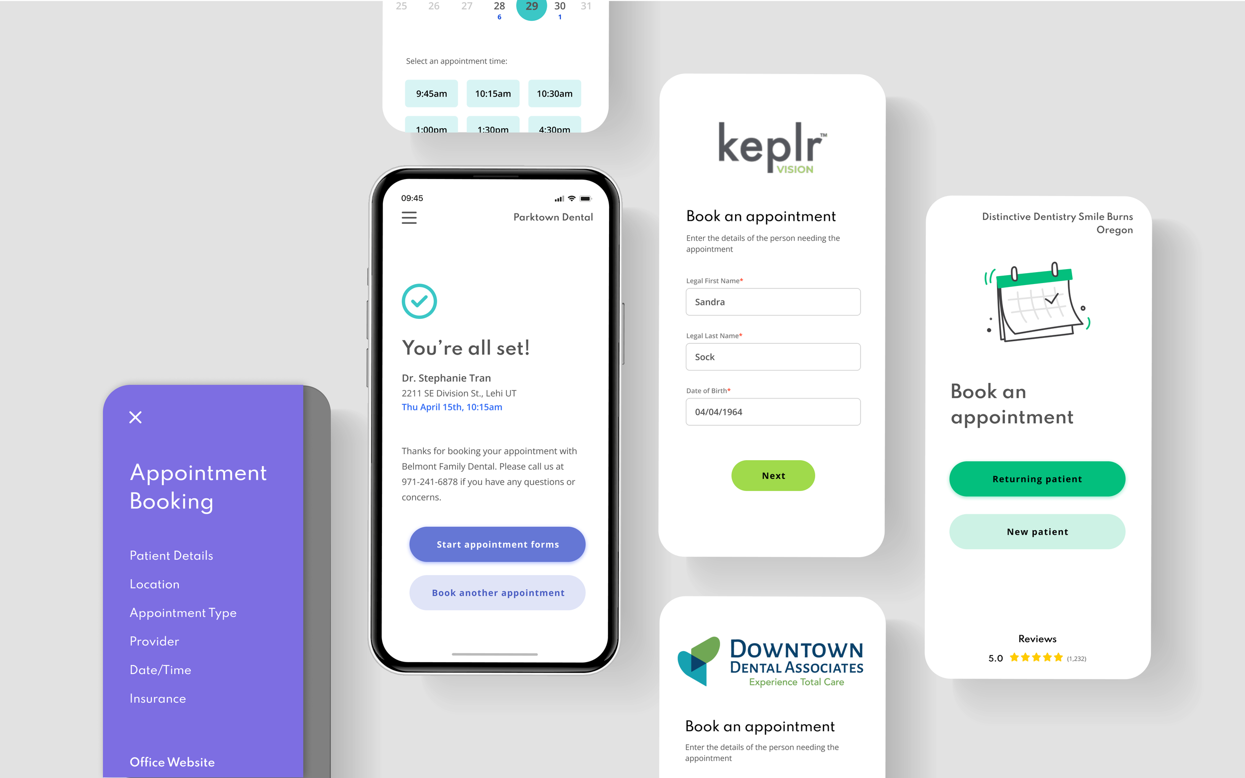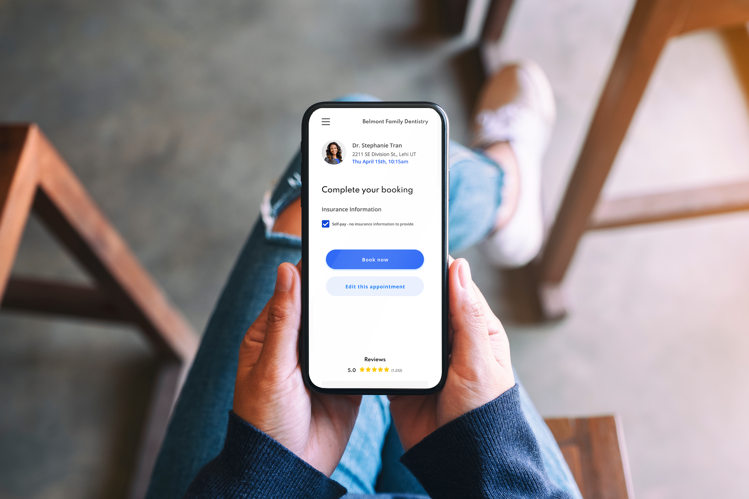
Modernizing the Scheduling Experience for Scalable, White-Label Enterprise Use
Patient Engagement Platform
Appointment
Scheduling
Solutionreach provides an all-in-one SaaS platform for healthcare practices to communicate with patients.
Mission: Provide healthcare organizations with a flexible platform that streamlines communication, manages patient relationships, and guides patients through their health journey - reducing administrative burden, improving satisfaction and loyalty, and supporting practices of all sizes.
Serves thousands of practices with a team of ~400.
Tools include two-way texting, appointment reminders, recall (i.e., re-engaging patients), digital intake forms, and more.
Platform integrates with 400+ PM/EHR systems
End users include operations managers, scheduling coordinators, billing managers, patients

Project Background
After reviewing the product ecosystem, I advocated for a redesign of the scheduling experience. Though a core patient engagement feature, it had become inconsistent, non-responsive, hard to navigate, and inaccessible. Momentum to prioritize the critical redesign came from my advocacy, the product team, and our largest enterprise client’s demand for an accessible solution.
Initial Goals
Meet WCAG 2.0 accessibility standards
Responsive, mobile-first design
Improve workflows and navigation
Modern, consistent UI
Constraints/Requirements
Coming soon
Early Design Exploration
Responsive Design & Customization
-
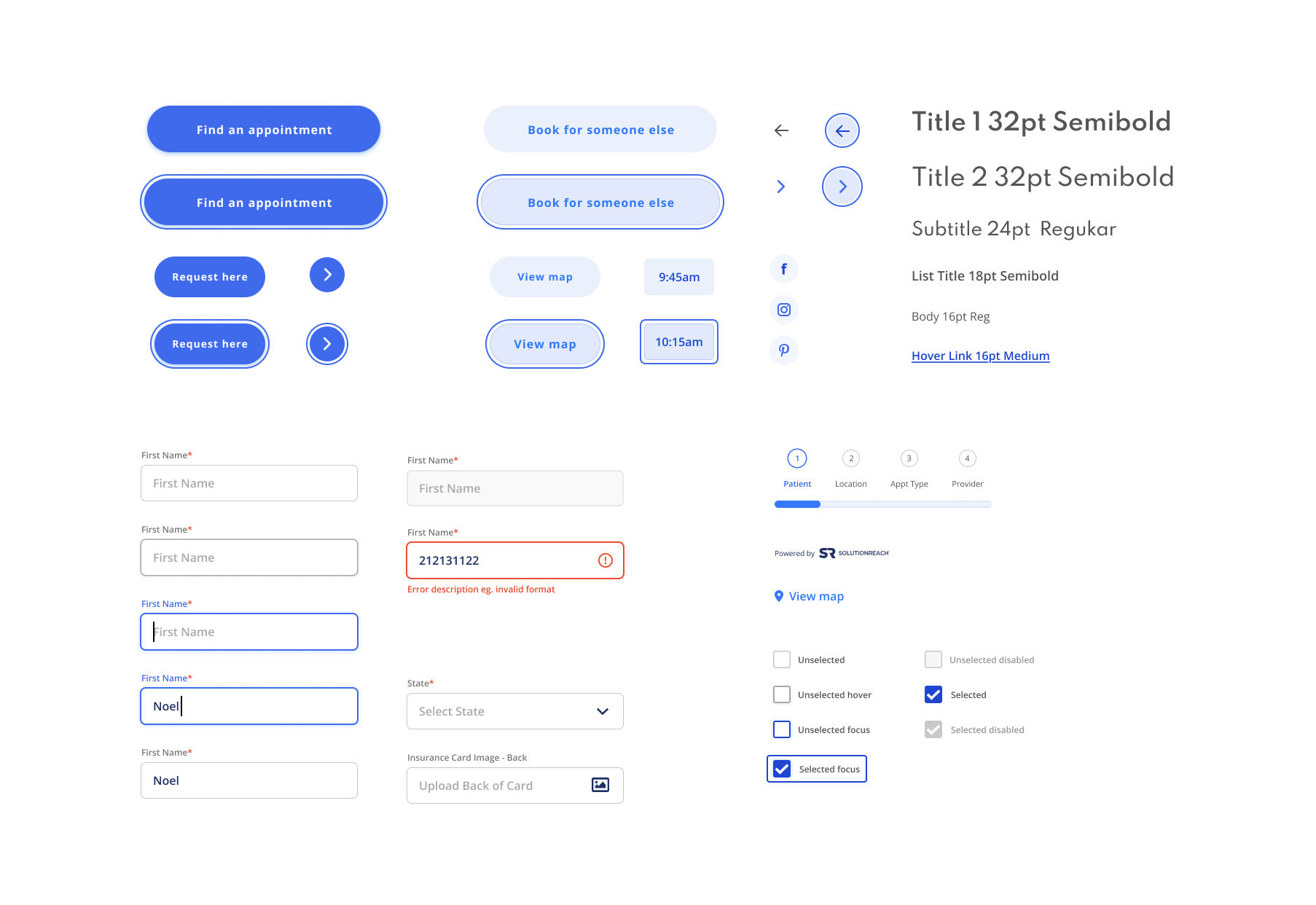
Deliverable: UI Library
This project involved developing a new collection of WCAG 2.0 compliant UI components designed to ensure consistency, scalability, and long-term flexibility.
-
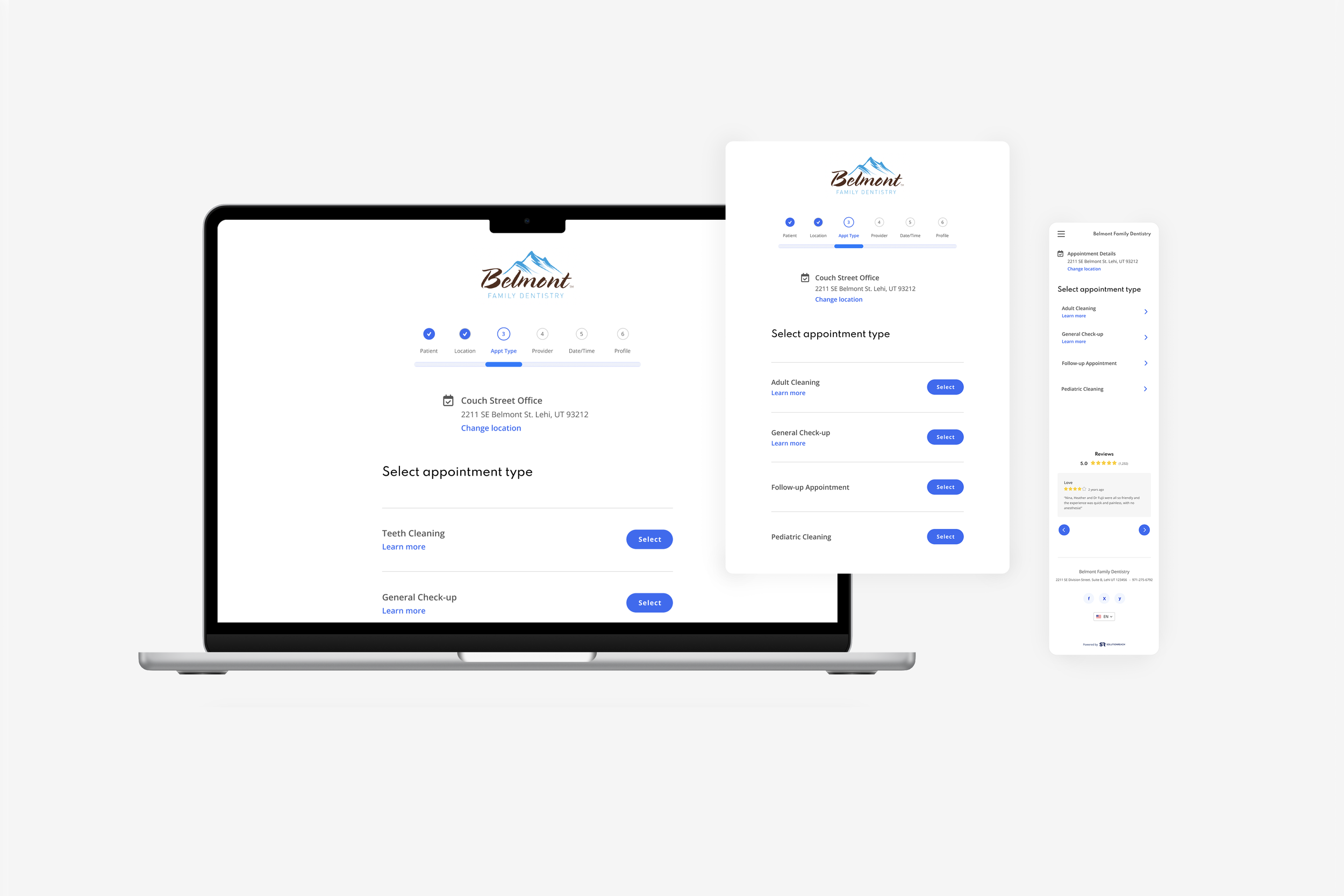
Deliverable: Responsive Design
A fully responsive interface design that replaced the previous desktop-only layout. I advocated for and led the shift toward a responsive design system to improve usability and accessibility across all screen sizes.
-
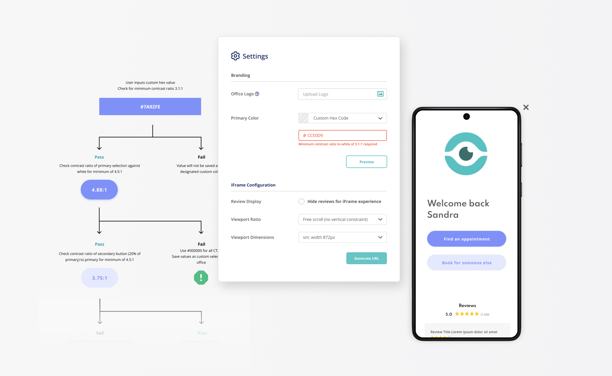
Deliverable: White Label Configuration
Defining settings allowing clients to create their own customized interface required establishing clear parameters to maintain design integrity. Limits on logo dimensions, predefined color palette options, the ability for users to select custom colors within accessibility-compliant contrast ratios, and iFrame ratios were all developed as part of this deliverable.
Protoyping
Creating a functional prototype in the final stages of design helps align expectations across all stakeholders by translating concepts into an interactive, realistic experience. It serves as a valuable resource for the engineering team, providing clear guidance on behavior, flow, and interactions during development. Additionally, the prototype enables early usability testing and feedback from potential beta clients, allowing the team to validate design decisions and make targeted refinements before full implementation.
Summary
This project focused on modernizing the company’s scheduling interface to better support business goals for a diverse range of healthcare specialties. The new responsive design provides a seamless, end-to-end experience that guides users from selecting locations and appointment types to confirming times within an accessible and intuitive interface.
Designed as a white-label product for enterprise clients, the default experience also works effectively for SMB clients, maintaining the company’s tone and alignment with the broader market. Configurable options for branding, form fields, and language, allow clients to tailor the interface for their unique needs while benefiting from smooth integration with our existing patient communication platform.
